Contact Form 7是Wordpress插件,不需要多做介绍,作为询盘表单插件,全球使用人数最多。虽然功能强大,但是外观太丑,需要手写CSS。
虽然CSS我也不是很会,通过谷歌查找教程,也学了些基本,把表单基本上改改还是能看,最起码比没改好吧。
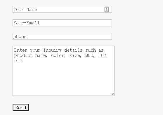
没加CSS之前:
加了CSS之后:
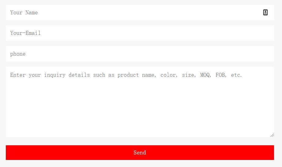
虽然改的不是很好,起码还是能稍微看一下。
表单代码:
[text* your-name placeholder akismet:author "Your Name"]

[email* your-email placeholder akismet:author_email "Your-Email"]

[textarea* your-message x5 placeholder "Enter your inquiry details such as product name, color, size, MOQ, FOB, etc."]

<p style="text-align: center;">*We respect your confidentiality and all information are protected.</p>
[submit "Send"]
CSS如下:
.wpcf7-text,.wpcf7-textarea{
  width:100%;
  font-size: 16px !important;
  padding:12px !important;
}
.wpcf7-submit{
  width:100%;
  background-color: #0060bf!important;
  color: white;
  border:none !important;
  font-size: 16px !important;
  padding:10px !important;
}
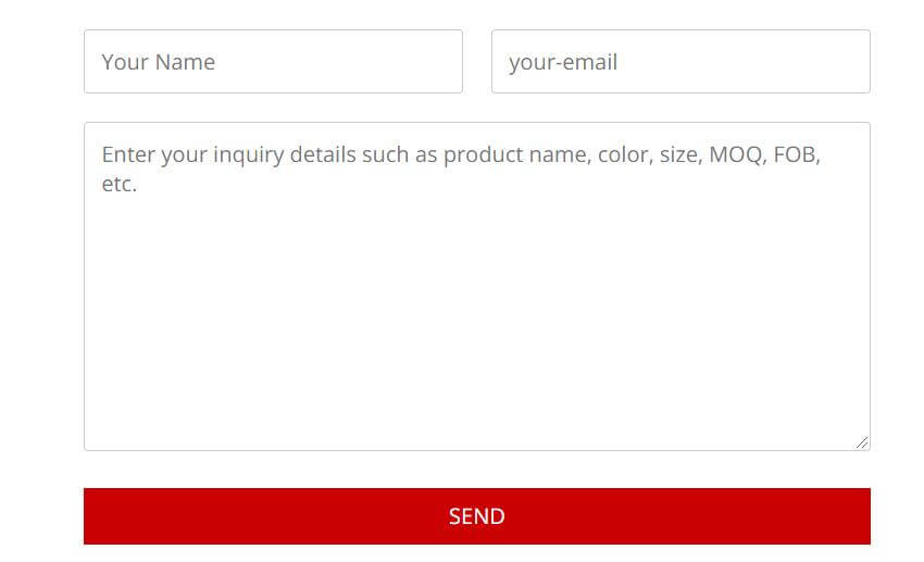
响应式拆分2列表单:
表单代码:
<div id="responsive-form" class="clearfix">

<div class="form-row">
<div class="column-half">[text* your-name placeholder "Your Name"]</div>
<div class="column-half">[email* your-email placeholder "your-email"]</div>
</div>

<div class="form-row">
<div class="column-full">[textarea your-message placeholder "Enter your inquiry details such as product name, color, size, MOQ, FOB, etc."]</div>
</div>

<div class="form-row">
<div class="column-full">[submit "Send"]</div>
</div>

</div><!--end responsive-form-->
CSS优化代码:
/*Contact form 7两列*/
#responsive-form{
  max-width:600px /*-- change this to get your desired form width --*/;
  margin:0 auto;
        width:100%;
}
.form-row{
  width: 100%;
}
.column-half, .column-full{
  float: left;
  position: relative;
  padding: 0.65rem;
  width:100%;
  -webkit-box-sizing: border-box;
        -moz-box-sizing: border-box;
        box-sizing: border-box
}
.clearfix:after {
  content: "";
  display: table;
  clear: both;
}
/**---------------- Media query ----------------**/
@media only screen and (min-width: 48em) {
  .column-half{
    width: 50%;
  }
}
.wpcf7 input[type="text"], .wpcf7 input[type="email"], .wpcf7 textarea {
  width: 100%;
  padding: 8px;
  border: 1px solid #ccc;
  border-radius: 3px;
  -webkit-box-sizing: border-box;
   -moz-box-sizing: border-box;
        box-sizing: border-box
}
.wpcf7 input[type="text"]:focus{
  background: #fff;
}
.wpcf7-submit{
  float: right;
  background: #CA0002;
  color: #fff;
  text-transform: uppercase;
  border: none;
  padding: 8px 20px;
  cursor: pointer;
}
.wpcf7-submit:hover{
  background: #ff0000;
}
span.wpcf7-not-valid-tip{
  text-shadow: none;
  font-size: 12px;
  color: #fff;
  background: #ff0000;
  padding: 5px;
}
div.wpcf7-validation-errors {
  text-shadow: none;
  border: transparent;
  background: #f9cd00;
  padding: 5px;
  color: #9C6533;
  text-align: center;
  margin: 0;
  font-size: 12px;
}
div.wpcf7-mail-sent-ok{
  text-align: center;
  text-shadow: none;
  padding: 5px;
  font-size: 12px;
  background: #59a80f;
  border-color: #59a80f;
  color: #fff;
  margin: 0;
}
能否把前面两栏并排显示呢?
个人不太喜欢。但也可以分两列,看文章代码
我粘贴了这段代码,但是没用
哪就不是代码的问题了